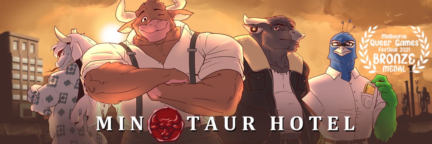
Minotaur Hotel
Visual Update Phase 1: Progress & Release Date
Hello, everyone! dilukha, Art Director, here. Around three months ago, we made an announcement explaining how the game’s Visual Update would be handled, and the team that’d be behind it. I strongly suggest that you go back to read it if you haven’t yet, as we go into detail about lots of things, but the short version is: the VU will be progressively rolled out in five phases, taking around four months each, though we expect the most important assets to be finished by the third phase. It will include every sprite and CG in the game, a lot of backgrounds and an updated UI, everything in a new, painterly style and full 1980p resolution.
With that out of the way, let’s get to the big news:
VU: Hotel Basics 1 will be released on January of 2026. New year, new Minotaur Hotel!!
This update will be made public straight away, so you won’t have to worry about a Patreon exclusivity period. We wanted to release it publicly so long-time followers of the project will be able to check it out as soon as possible, and so new readers will take it as a chance to hop in. As we’ve mentioned before, Hotel Basics 1 will cover roughly the first act of the story, so if you know someone who has been meaning to read Minotaur Hotel, that’d be a good moment. As always, we want to thank our patrons for making the VU possible!
Now, let me do a brief overview of what we have been working on for the past months:
(Note: many of the images that are included here are not final and might be subject to change in the final release)
Sprites
As I mentioned in the past update, we know how essential sprites are to the experience of the game — these are the versions of the characters that you’ll be interacting with most of the time, so it’s extremely important that they’re attractive, expressive and stylistically consistent. The spriting team, currently made up by Rayan, Lappan and me, have been working together to ensure the new sprites feel polished and high quality while still preserving familiarity with the original sprites. Let’s start off by taking a look at America’s favorite gryphon:
Rayan was in charge of Luke’s sprite set, and he did an excellent job! Even before Nanoff’s departure, Luke was one of the oldest sprites and long overdue for a rehaul, so it’s been very exciting to see him come together.
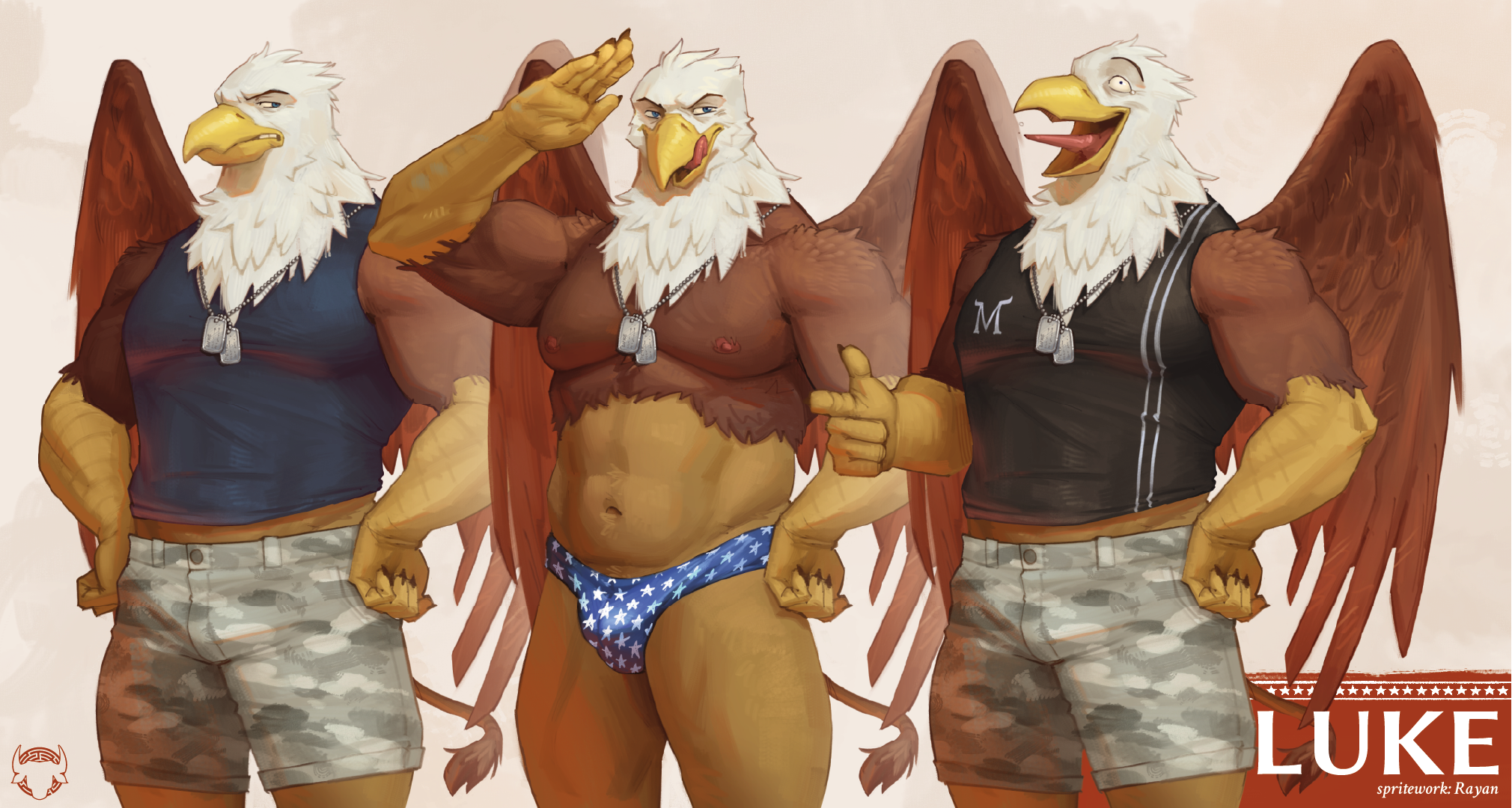
I’ve talked about the general direction we’d be taking, but with Luke’s sprites, I can finally show you what I meant by all that. This time, the sprites are rendered, with visible brushstrokes in warmer tones that give it a handpainted vibe. They have a mysterious red light meant to evoke the magical nature of the setting, as a little signature of the style going forward. We’ve also made sure that our pivot to a more grounded depiction didn’t sacrifice expressiveness, and there’s been a lot of sweat, tears and redlining put into keeping the emotion and charm of the original sprites. Luke here didn’t really change any, he’s still the same as ever! On the other hand…
Ok, so, you guys know how Kota’s design has already gone through three iterations, right? …You know what would be really funny?
Now, this redesign isn’t as radical as his last one, most of his key traits have been preserved, but he has been subjected to a couple adjustments. It was Lappan’s task to work on him, and he made some suggestions that we couldn’t help but find extremely charming and befitting of his character. Kota now sports a longer, flowier haircut, differently shaped horns, a pair of noodle whiskers and a more visible tail. A little fang, too! On top of that, he received a nice new outfit for the bar, and he’s generally hairier all over.
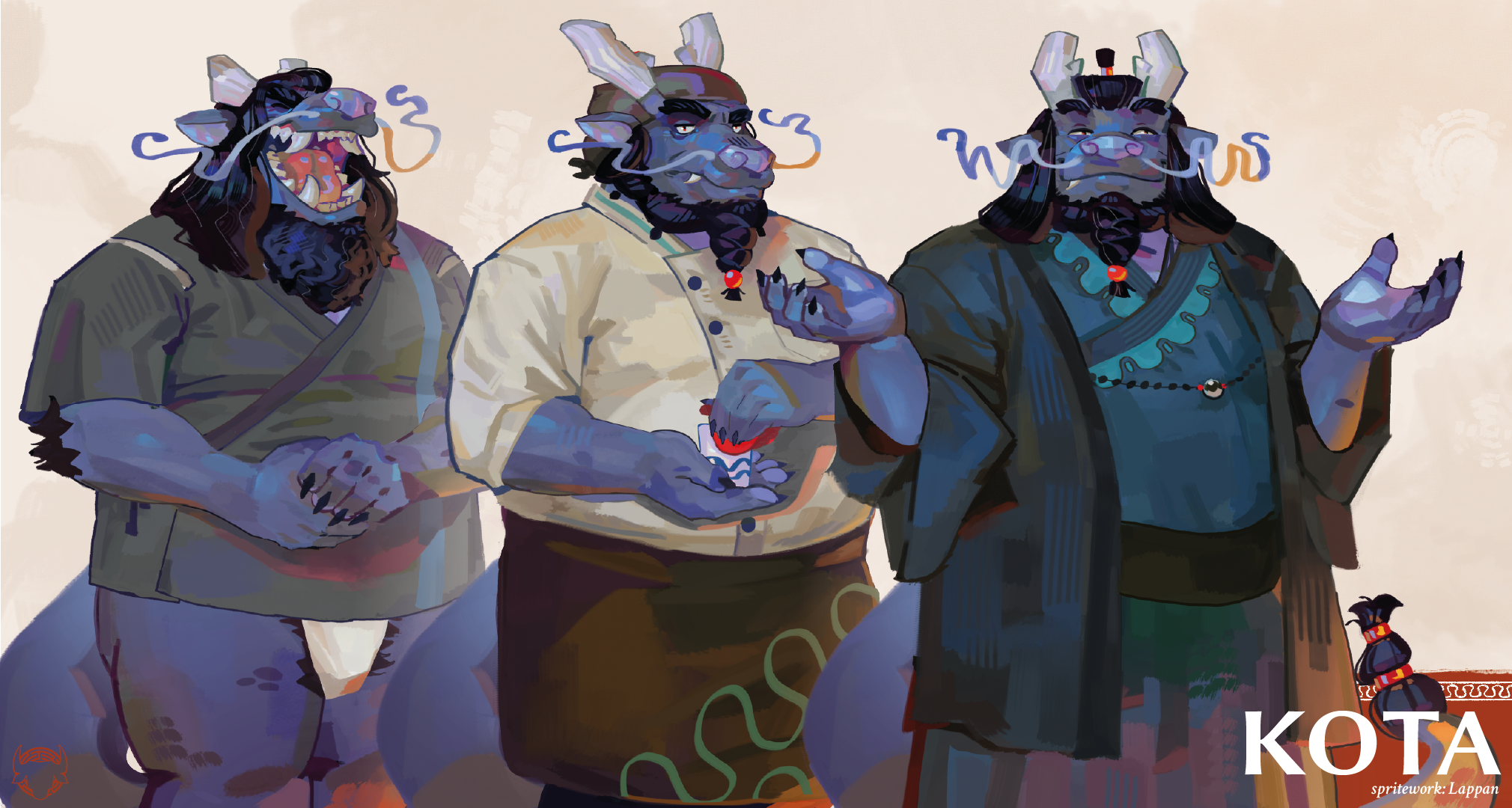
Of course, please tell us how you feel about these changes! As always, we value player feedback, and we’re not opposed to going back to readjust things if we see compelling reasons to do so.
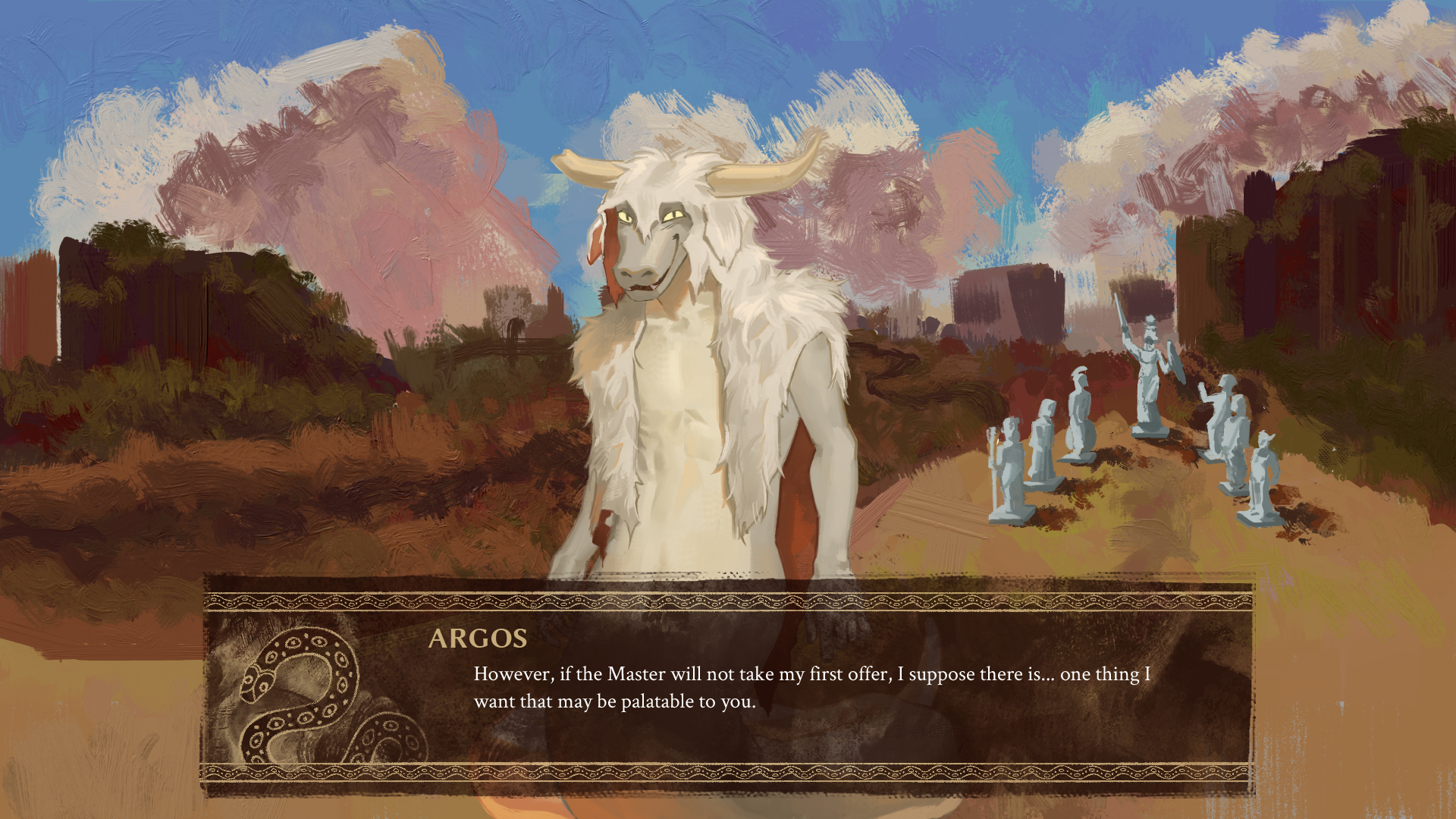
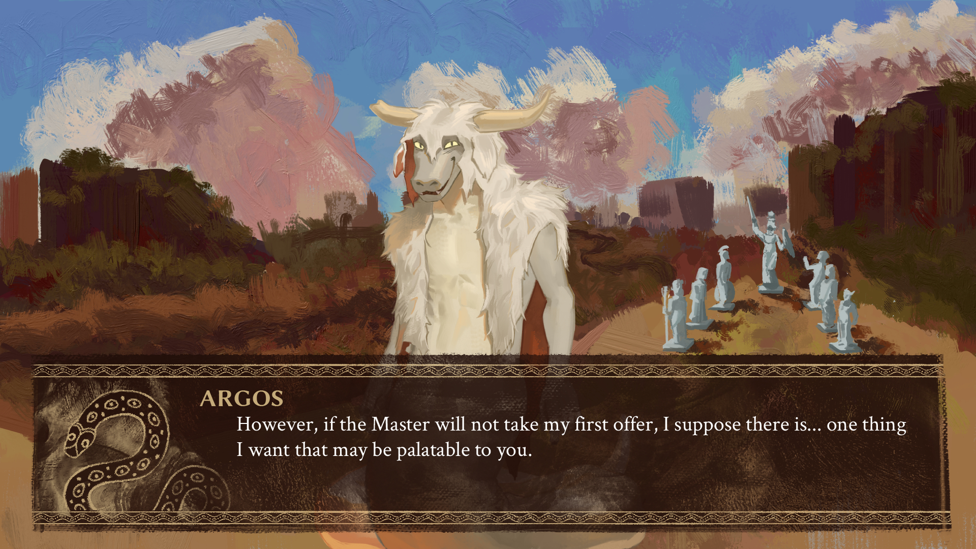
Moving on to none other than your most loyal servant! People who’ve followed me for a while might be aware that Argos is one of my favorite characters ever, so it won’t come as a surprise that I took the liberty of working on his sprite set myself — and it’s been a delight to work on this smug little rascal.
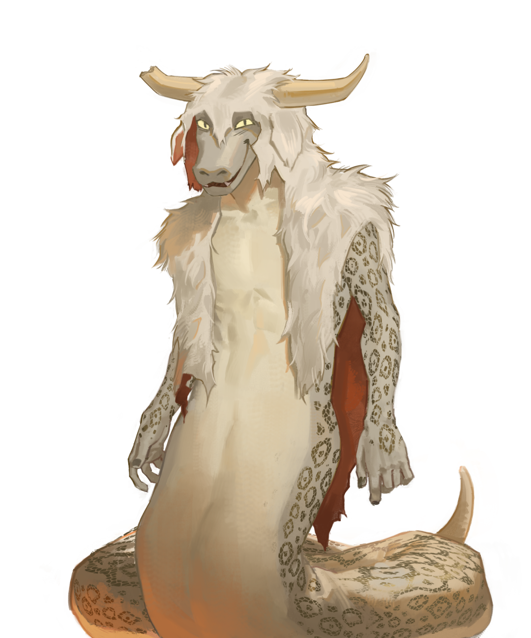
He’s also been revised, though that’s less of a design change and more of a simple difference in depiction. One thing that had come up in our discussions with the writing team was that the way Argos was drawn didn’t really match the way he was described in-text — slender to a bony degree — and keeping in mind that we were aiming for a more grounded direction, it was necessary to have his build be better reflected by his sprite set.
So he’s been hit with the twink ray, irreversible. This version of Argos not only adds a bit of variety and contrast against the generally larger builds of the rest of the cast, but also highlights the sheer pathetic, absolute wet sock appeal of his character.
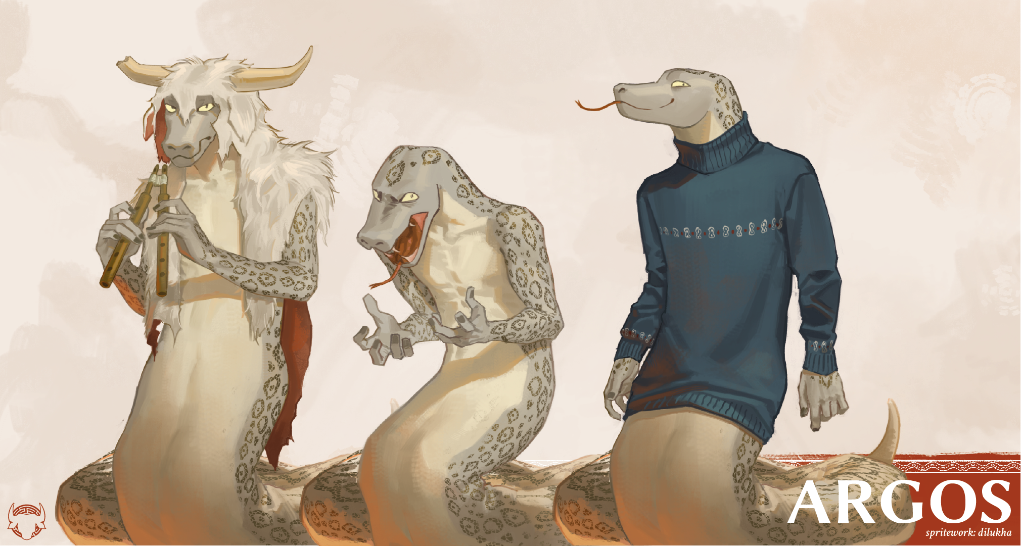
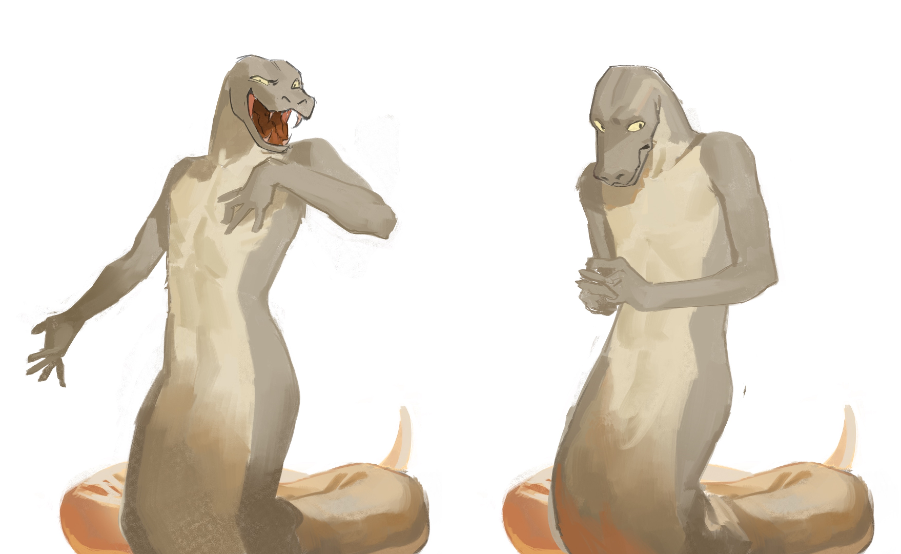
Additionally, I decided to give him two additional poses (on top of the ones he already has) that will be retroactively added to some of his scenes. His original sprite set had a lot of emotional nuance, which I always loved, but a limitation he always had was that his poses had to work for both “sides” of his character, which are very different. These two new poses, Theatrical and Shy, are meant to really drive home the shift between Argos Panoptes, Foreman of the Labyrinth, and… well, you know. These poses are still in their sketch phase, so you’ll have to wait a bit more to see them finished!
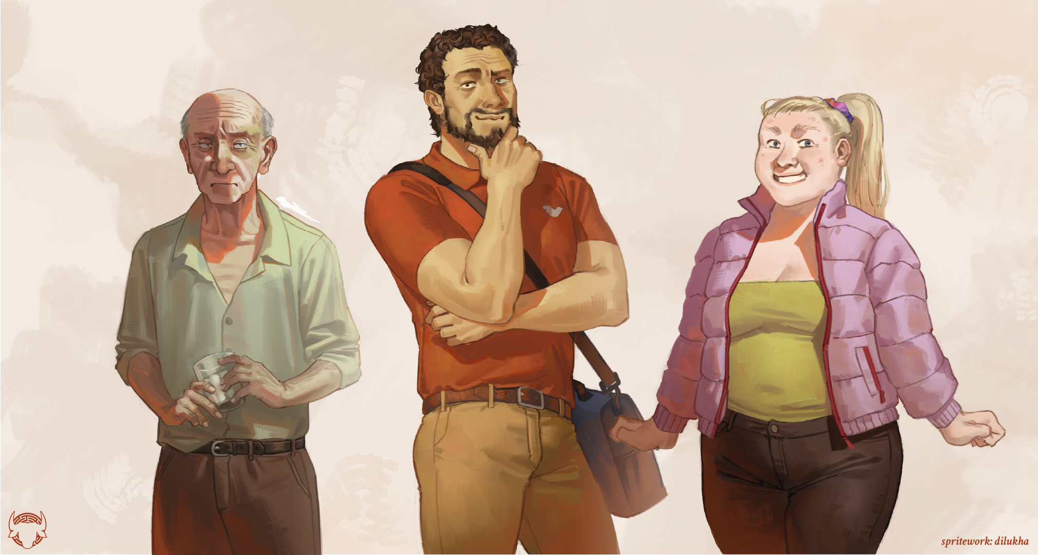
And it’s not just the main characters that have received attention. Minotaur Hotel has many human side characters (I myself was surprised by the amount when I sat down to actually count them) and they’re an important part of the world that make it feel lived in, even if they’re not the main focus. The original intention of the human sprites was to make them feel ordinary, “kind of ugly” in the way normal people you’d pass by on the street are, as a point of contrast against the fantastic mythicals you come across in the hotel. It was obviously important to keep that naturalistic approach — we are going for a more grounded style, after all — and hey, it was a fun exercise to try to find a way to make humans fit in with the furry sprites. Here’s the new sprites for the old man, a certain tricky deliveryman, and everyone’s favorite hotel guest. These were done by me, but other members of the spriting team will work on human sprites as well!
I mentioned it before, but it bears repeating: Asterion will not be having his sprites redone in this update. He’s both the most important character and has the most complicated spriteset by many orders of magnitude; he’s a challenge that we’ll have to take on when we know we can do him justice. So, again, please be patient with us. The bull will come home eventually. In the meanwhile, let’s move on to…
CGs & Backgrounds
We mentioned before that some of the backgrounds in the game, not only those drawn by Nanoff but also some of the ones that used to be royalty-free images, would be getting updated. One of the biggest priorities for us was the Valley. You spend a significant amount of time here, after all; it’s the background for the expeditions and most of Argos’ scenes, which make up a pretty big chunk of both the first and second act. It always deserved something a bit more personalized. So, lo and behold:
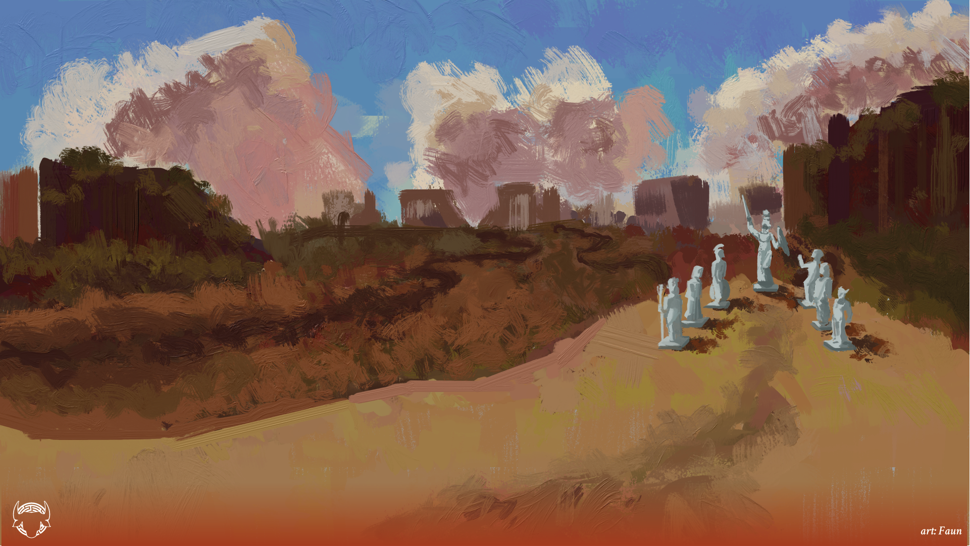
Faun, one of our background artists, was the one tasked with updating the valley, and needless to say, they did an amazing job. Their delightful use of color variation and the realistic brushwork really gives the valley that natural, material feel that we’re going for, and you can expect that to become a staple of exterior shots from now on. Also, hey, remember those statues of the Olympians that are mentioned at the beginning of the story? They’re actually here now! A good part of going back to update the visuals is that we can just go and add those little details, which is really fun.
New illustrations for both Kota’s and Luke’s versions of the bar were also high on our priority list, and Kinutao is the artist that has been working hard on figuring them out. Of course, that means redesigning them from scratch, taking in account how Kota’s and Luke’s personality affect the vibe of each version. What we can show you right now are the 3D models that Kinu has designed:
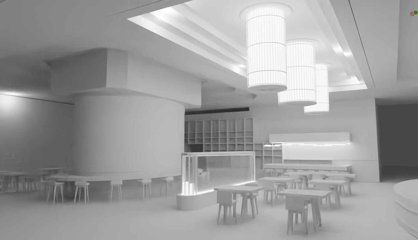
While Kota’s version of the bar is a very sophisticated, geometric space arranged in an almost grid-like way, with heavy pillars that will have painted murals on them, befitting of Kota’s elegant, strict nature…
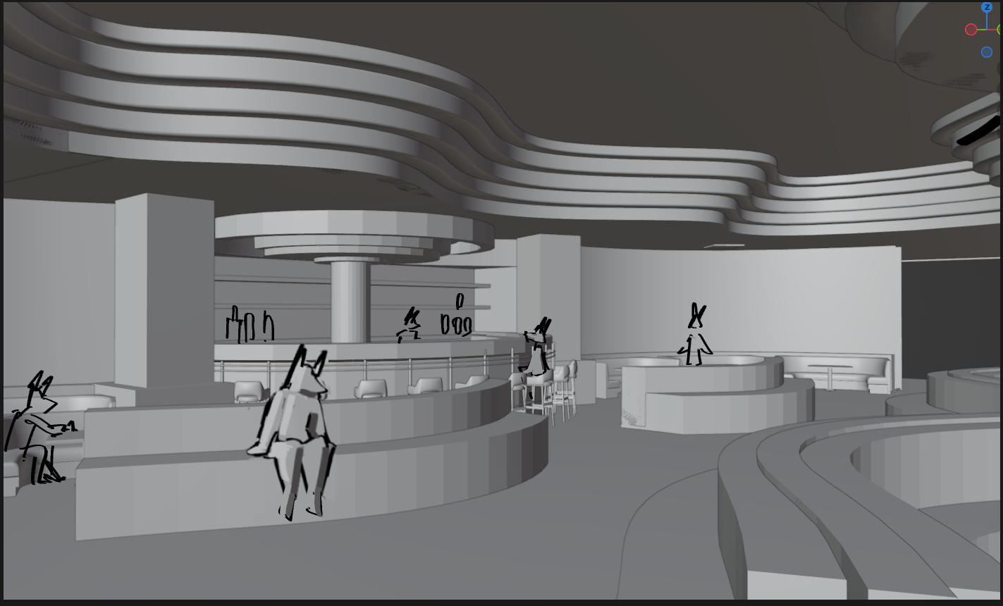
Luke’s is full of wavy, organic shapes and neon lights, giving it that flashy, slightly tacky nightclub vibe that Luke feels at home in.
Being the one responsible for designing the bar backgrounds, Kinu himself is also the one working on the CGs for Asterion’s concert. This one was one of the CGs in most urgent need of replacement, since not only is it one of the oldest ones, but even key elements (such as the design for Asterion’s lyre) have changed along the course of development. It’s also a big step for Asterion as a character, who’s just now starting to open himself up to the world again. It’s a very intimate moment that shows his growing closeness with both the guests and the MC, so needless to say, Kinu has put a lot of effort into really elevating that beautiful moment.
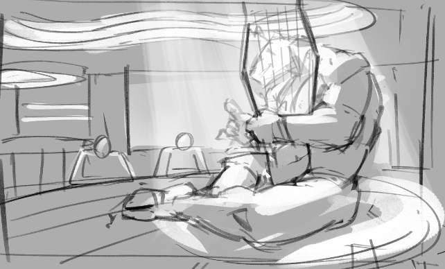
Asterion’s face bathed in light, with the lyre strings’ partially covering him, as if he was getting completely lost in the music… Both the writing team and me were in love with how conceptually strong this idea is, and we can’t wait for everyone to be able to see it finished in-game!
And as our last CG to showcase for today… ok, let me set the scene for this one.
The cold room extends into absolute darkness, a hallway in and of itself. You proceed, scraping your shoes on the floor so you don't trip over the refuse.
The entire floor is covered with discarded glasses and cans. Whatever scraps were left in them has long rotted, dried and crumbled into dust.
Both your footsteps and breathing echo. The overbearing humidity drapes across your back, and your breathing becomes agitated. The stench is stronger.
Your sight finally adapts to the dark. At what must be the cold room's far wall,
you notice the faintest glimmer…
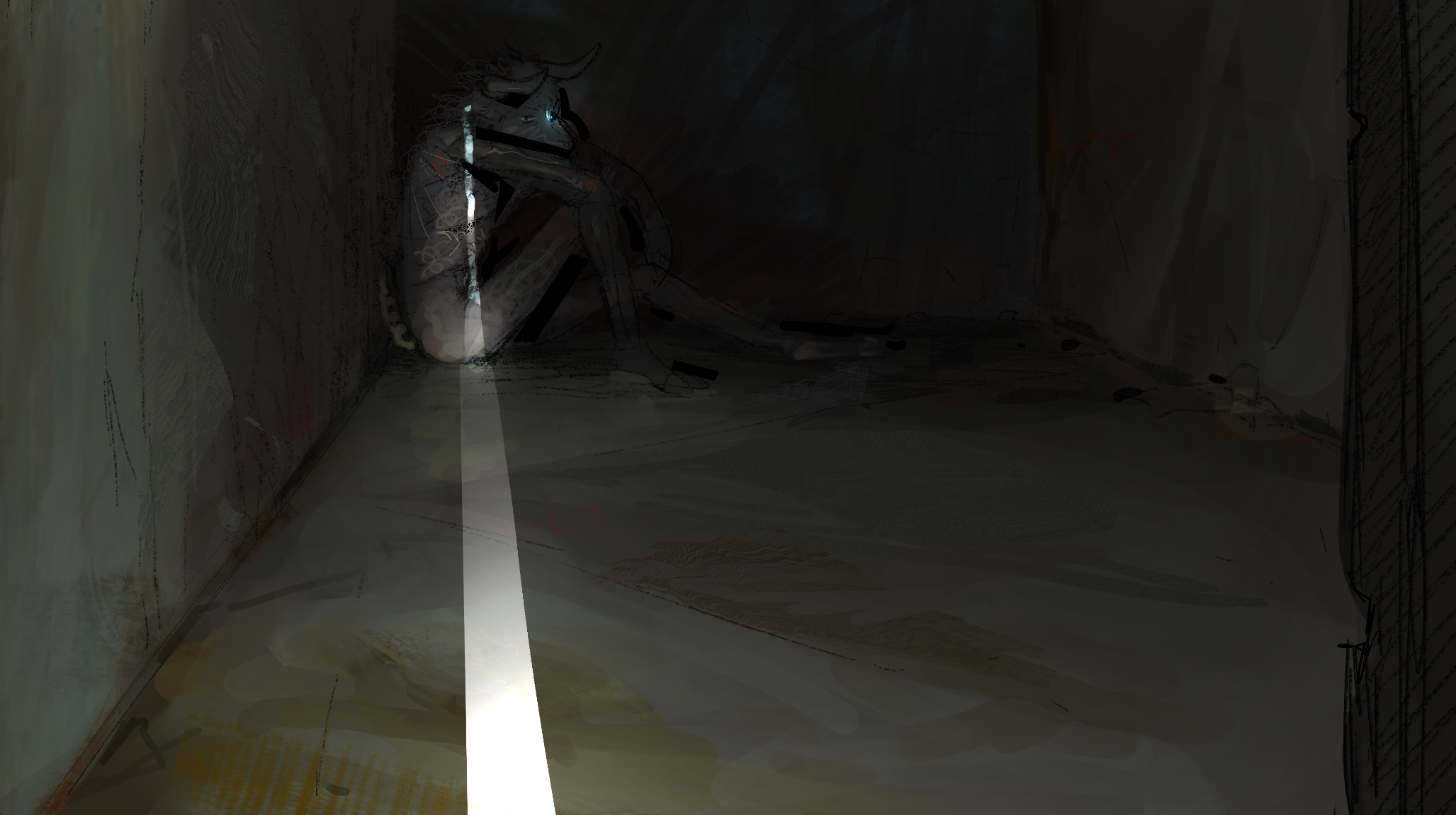
Phwog was tasked with remaking what might just be one of the most important illustrations in the entire game; Asterion’s introduction. After trying out a couple different compositions, this is what Phwog arrived at, and the tension on display here is just spine chilling. Mind you, this is just a sketch still, so you can expect it to look even better when it’s added into the game.
As a side note, those who played the last public release of the game might remember that we included a form in the end asking for your opinions on many things, and one of the questions was regarding what kind of thing you’d be most excited about for the Visual Update. The most popular answer was overwhelmingly that you guys would like us to go back to add new CGs for key story moments, and worry not — we’ve taken note of that, and it’ll be taken into account when planning future phases.
Other than that, we’ve got one last thing to show you:
User Interface
One of the things we mentioned would also be getting an update was the game’s resolution and UI, and you might be surprised by the amount of work that has gone into that so far. Not only it’d be a shame if all that new art we’ve made was shackled down to the game’s native 1280 x 720p resolution, but the UI as it looks right now is a bit too digital and clean for this painterly direction we’re going in. I, personally, am also particularly finicky about it — UI design is one of my main fields of study. For that reason, redesigning the game’s UI is something that has been receiving a lot of attention.
When Hotel Basics 1 comes out, the game you’ll be greeted with will look a bit more like this:
(not actual game footage)
Hey, it really feels like everything is coming together now!
This new text box is not only sporting a new uneven, textured style, but it leaves a lot more space for the art in the game to breathe! Minoanon described it as a change that “feels vast and expansive in a way that fundamentally changes the game’s substance”, and I really like that — it feels like you’re getting a wider view into this fantastic world. I’m also happy that we could preserve the textured borders, as they were always part of the game’s identity to me.
Also, elephant in the room, they have side portraits now!
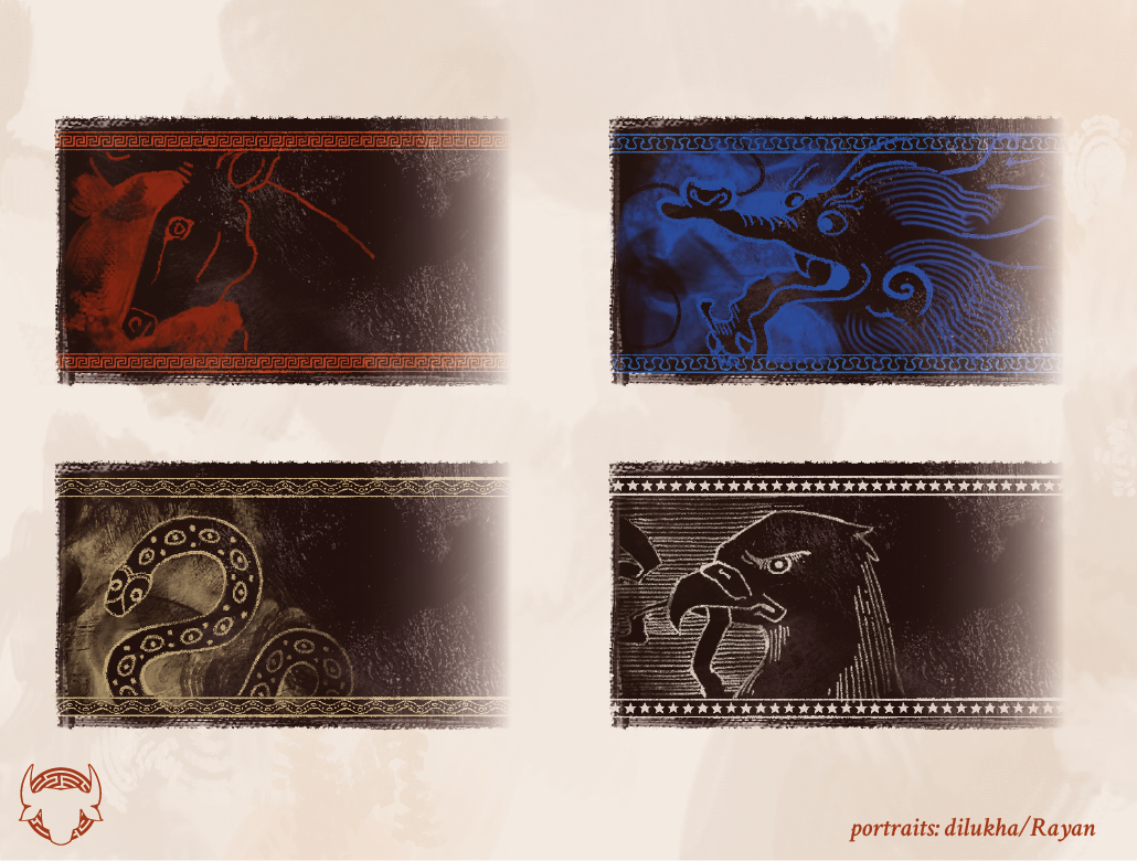
We felt that having side portraits as more abstract representations of the characters would be a good way to have some art directly inspired by their respective cultures, highlighting the mythological theming of the game in a way that felt simple and unique. We went through numerous iterations with different approaches for the side portraits, and in the end, we settled for this background-like version that felt unobtrusive while still communicating style through texture alone. We hope they’re a nice little addition to your experience!
It bears mentioning that the game will also have a different UI between the PC and the Android versions. Android players make up a huge chunk of our playerbase, so this version of the UI should be more comfortable to read and interact with from a smaller phone screen.
Now, obviously, everything I’ve shown so far concerns only the text box. It has received significant attention because it’s the element that players will be in contact with throughout the vast majority of the game, but that doesn’t mean we’ve forgotten about the rest! Our original plan was to have the whole UI redesigned by Hotel Basics 1, but we ended up noticing a lot of points where the UX and navigation of the game could be improved (such as the Task Assignment and Daily Planning screens), but not without significant time going into testing and implementation. For that reason, the UI redesign will probably be also spread out between multiple updates, and the first phase will be released with some placeholders.
And that’s everything we have to show you for today! I have to say, I have been extremely happy watching everything come together, and I’m glad we managed to find such a good team, so I hope this progress update has made you as excited as I am. As always, we have to thank our Patreons, who have generously funded everything shown above, and every reader who has stuck with the game so far. This was just a peek — we still have lots of great things to show you.
— dilukha
P.S.: Mino here! If you want to support us with the Visual Update, remember we have a Patreon and a SubscribeStar now!
Comments
Log in with itch.io to leave a comment.
question will the walkthrough guide get updated too?
Yes. Some stuff in there is no longer accurate as we have changed how some systems work. We will get to it later down the road when things are more consolidated.
wild to see how far this game has come, been followin progress for quite a while now but took a break only to come back and see peak. keep cookin y'all this is amazing stuff
Holy Shit, absolutely peak. Can't wait for this update!
Hold the fuckin phone. Greta in that image is shown with 2 other characters. Is *she*.... like them?
I'm loving what you have come up with so far. I'll be looking forward to what the VN will be going forward
DAM, that is some eye cokecane if I were to say something
I'm gonna miss the old sprites and it's simpleness but the new sprites really show how much the game have gone through, can't wait to see it's full glory.
this is so amazing!! cannot wait :) I love the new human sprites especially!!
Beautiful work, well done, I look forward to seeing more! :)
Oh my god, this... I'm speechless, it's beautiful. If Minotaur Hotel was already a work of art in terms of narrative, this takes it to a visual masterpiece as well.
To be honest I was very dubitative of the benefits of the VU... well so far it's outstanding, this looks like an amazing work, bravo
GRETA LOOKS LIKE A PRINCESS NOW!!! Can’t wait to see her hit THAT pose.
The MC will have a sprite too? One of things that I like most about Extracurricular Activities is the fact that MC has his own sprite with his own expressions, the customization is a cool feature but the fact that the sprite exist and interact with the others is quite cool. Just a suggestion <3.
Other thing that I wanted to know is if the ''role'' that we choice for MC in the beginning will have more impact in the lore itself. I mean the way it is right now I feel it is just for some specific choices.
There are no plans to give the MC a sprite.
I'm going to do some minor tweaks in the writing as we implement the new sprites, but I don't plan anything major. Mind you, the Leader background will have a big benefit going for it somewhat soon.
Oh, that's cool! And that's the one I chose, I can't wait.
this is peak, absolute cinema!!!!!!!!! looks like a completely new game and in an amazing way ❤️❤️❤️❤️
HOLY SHI-
Oh my god I have no words to express this, STUNNING doesn't even gets near of what these updates will be! Congrats on the team!
Mind officially blown away🤯
HOLYYYYY!!! NICEEE!! LOVE THE NEW CGs AND SPRITESS!!!
Woah! This all looks astonishing!
I'm really hyped to read Mino hotel once again after all the updates now :o
HOLY FUCKING SHIT????? /pos
Immaculate. Exquisite. Magnificent. The cast looks SO good in your artstyle. Welcome to the team, diluka!
Honestly it's been a while since I've read Minotaur Hotel but I found it weird that everything with asterion was always sfw